Starbucks
China App
UX Design Improvements
BACKGROUND

• How does our App fit into overall customer journey?
• Is there any pains or wants from our current design?
• What are the opportunities that can help improve the experience offering for our customers?

FIND
Guerrilla interview & Observation
• In-store, quick interviews with random customers. The goal is to synthesis the main types of customers.
Guerrilla interview & Observation
• In-store, observing large quantity of people and identify common themes.
PERSONAS

ROUTINE KEEPER


BRAND ADVOCATOR

DRINK LOVER

CASUAL DRINKER

CONFIRM
In-depth interview & User testing
Contextual interview
• 1:1 interview with recruited customers, the goal is to map out journey and identify problems, needs & wants.
Gathering online reviews
• Collect typical issue reviews from Google play / App store and our CCC (Customer Call Center).
WHAT DID USER SAY
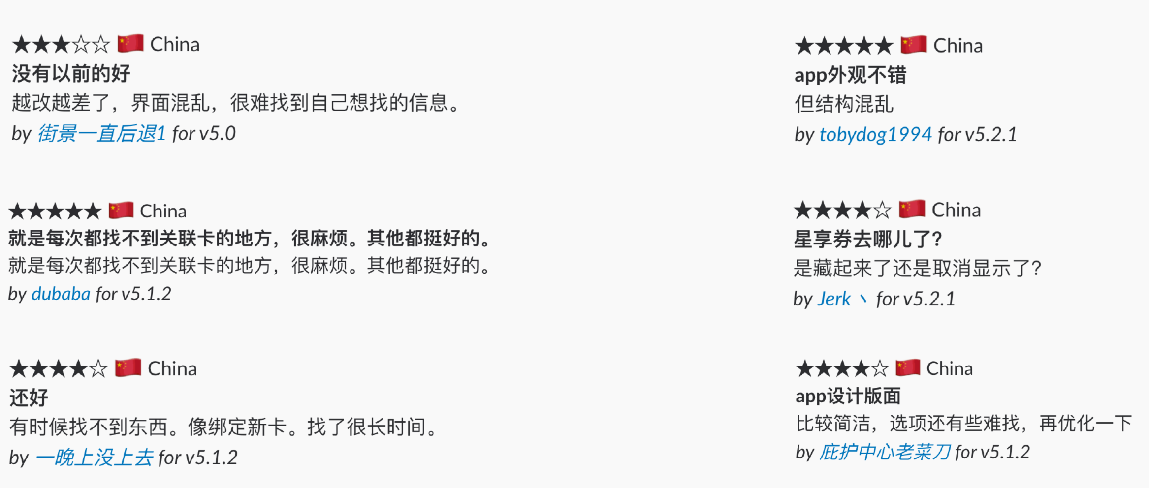
PROBLEMS
Information Structure
• “Rewards” entrance and “Login” is the same place, confusing design.
• Users find it difficult to get coupon information directly.
• Purchase & reload SVC card flow is different from common Chinese mobile payment pattern.
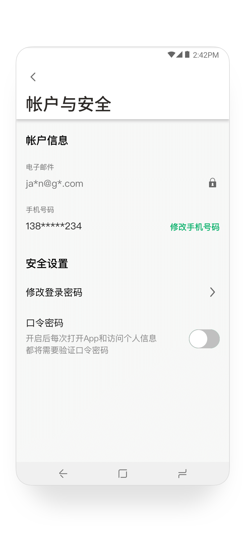
• Confusing about “Account”. “Change password” feature has discoverability issue.
OPPORTUNITIES
Information Structure
• Build better feature “mapping” of Sign-in and Rewards features.
• Let users find coupons more intuitively.
• Make payment flow more natural to Chinese customers.
• Optimize information structure for “Account”. e.g. change password.
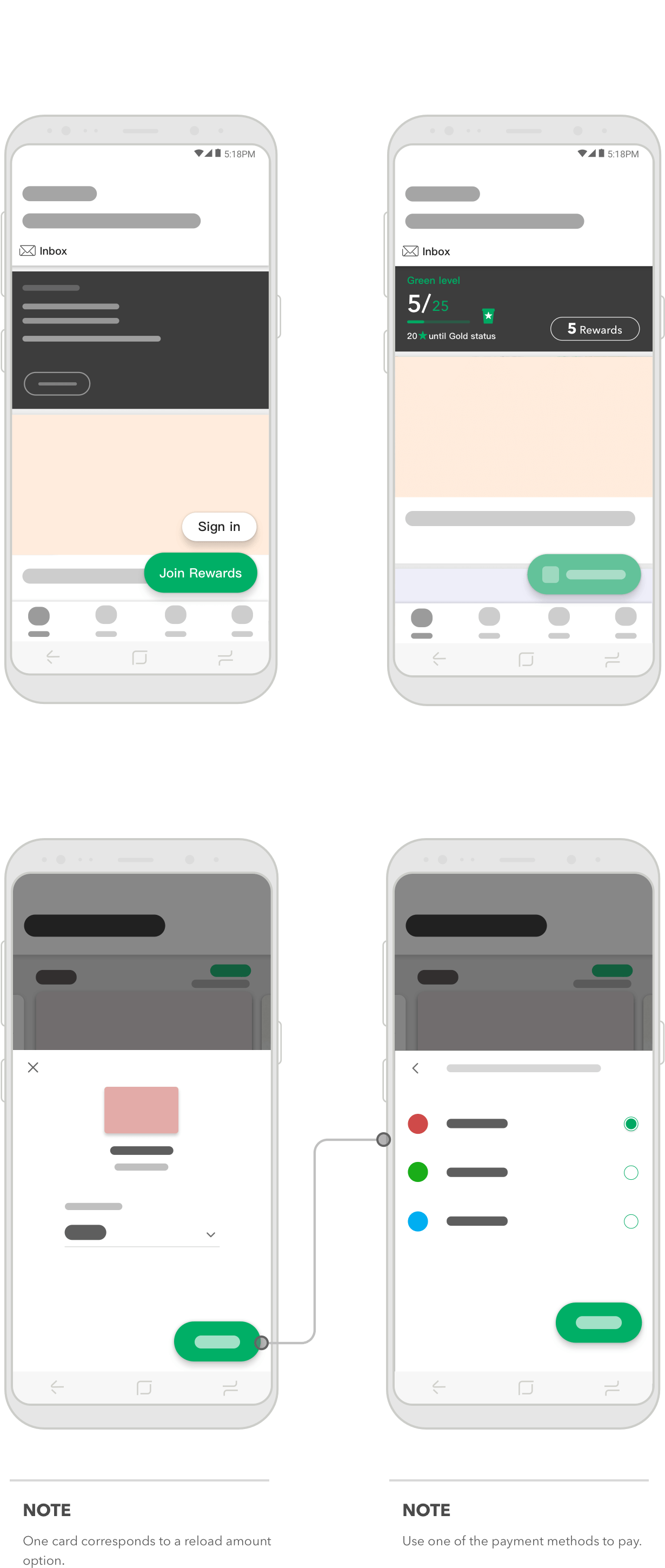
HOW MIGHT WE…
Build better feature
“mapping” of Sign-in and Rewards features
WHO: 1st time user of the APP.
TASK: Find coupons immediately after signing-in.
PROBLEM: They ignore the top menu since it used to be sign-in function.

QUOTES:
I couldn’t find where my coupons are at as I tapped here for log-in just now.
INSIGHTS:
In terms of feature mapping, there’s a lack of consistency for the top menu before and after sign-in.
Let users find coupons more intuitively
WHO: Starbucks membership user.
TASK: Check personal coupons.
PROBLEM: Users could not find the entrance for personal coupons.

NOTE
There are too many elements to disturb the user's attention. These kind of visual clutter makes coupon entrance difficult to be found by users.
QUOTES:
I think my coupon should be saved in “my Starbucks rewards” or “my account”.
INSIGHTS:
Most people click “My Starbucks Rewards” section or go to “Account”to check their remain coupons.
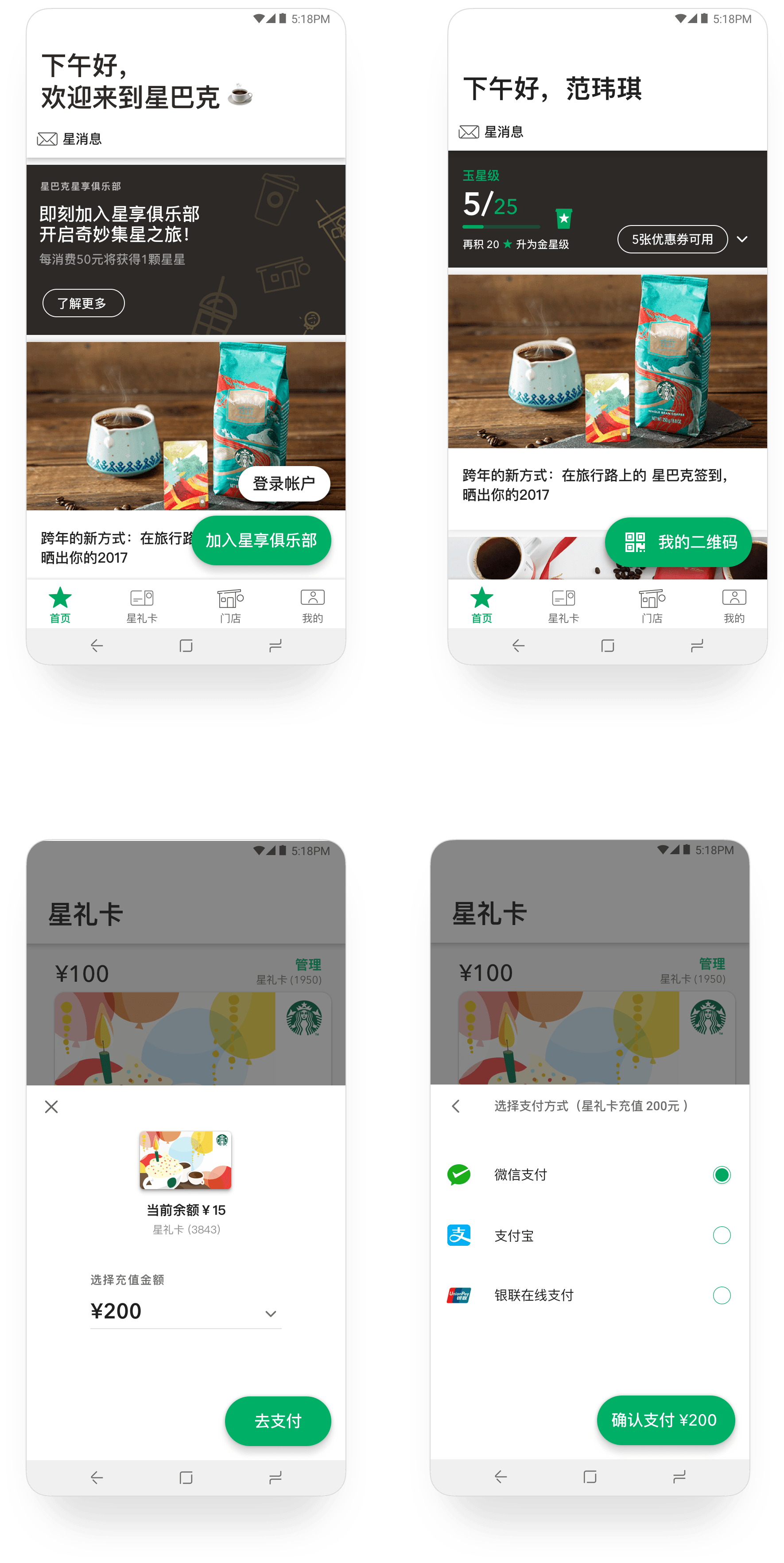
Make payment flow
more natural to Chinese customers.
WHO: App user.
TASK: Purchase SVC card through the app.
PROBLEM: Find the payment flow is different from other Chinese E-Commerce apps.

NOTE
Choose to reload the current SVC card, there is no need to show the card selectior again.
QUOTES:
Why product selection and payment are on the same page?
INSIGHTS:
Too many things need to do on the same page. It is relatively unexpected for customer to make payment at the same page as choosing product.
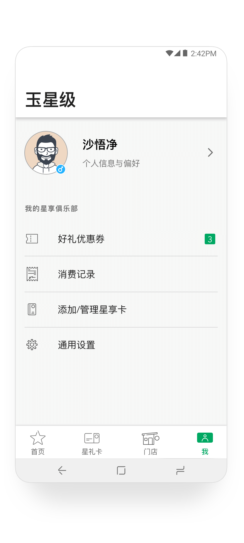
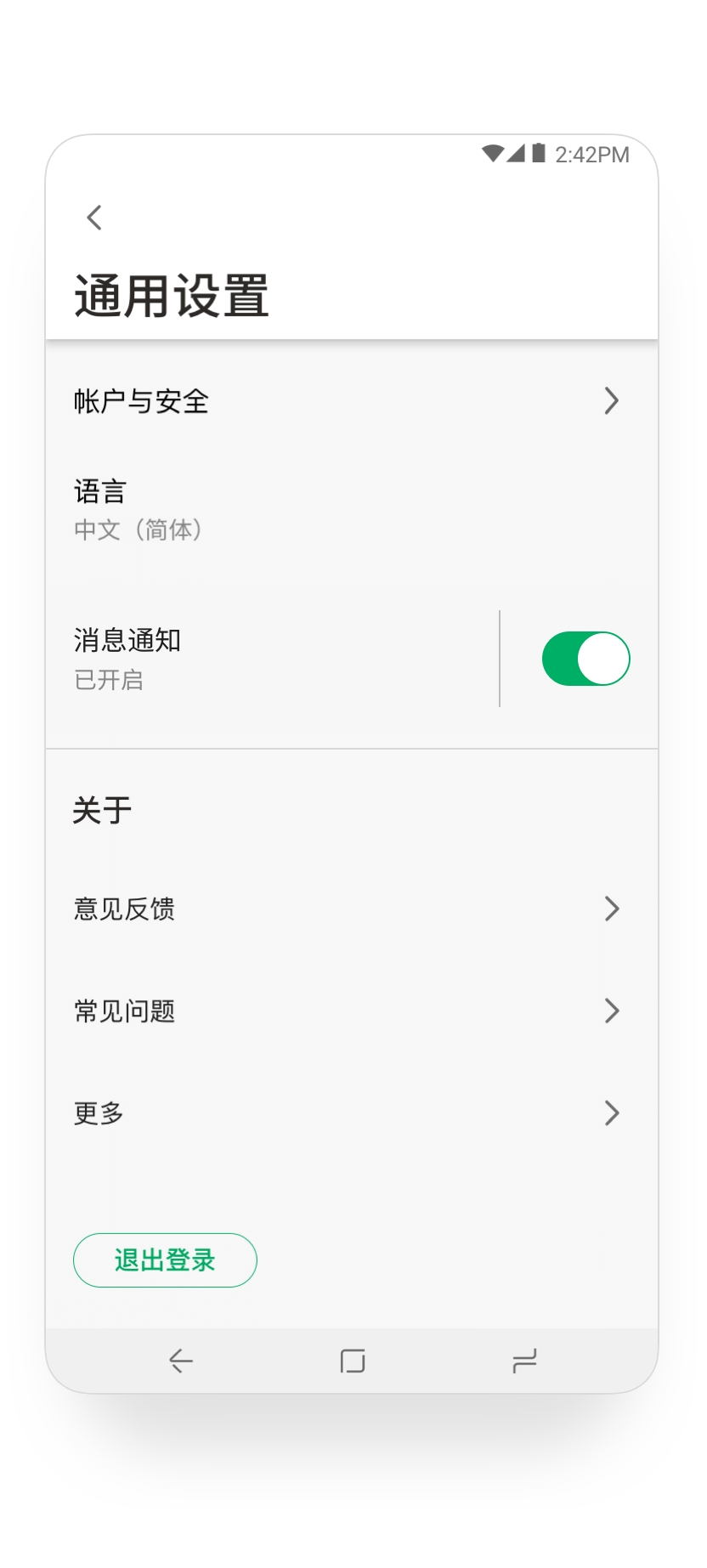
Optimize information structure for “Account”.
WHO: App user.
TASK: Change password.
PROBLEM: Couldn’t find the entry-point.

NOTE
Confusion in the structure and level of information makes users misunderstand the intended content.
QUOTES:
I would tap ‘security’ as it sounds like securing my account, then I tried ‘settings’ as it looks like my account setting, it is not very sensible to me to see it in ‘personal information’.
INSIGHTS:
All of the interviewees failed to find the feature the first try.
People would first go to Settings menu, then go to Security menu to find the feature.
RESOLVE
OUTCOMES